Every fleet tool puts units on a map. The question is what the map tells you. FleetTAB’s Map plots your whole Wialon fleet live — and then colors it, so the units that need attention separate themselves from the ones that are fine.
The map answers one question fast: which units aren’t reporting, and where? You set what “reporting” means, and the map does the rest.
Your whole fleet on one live map
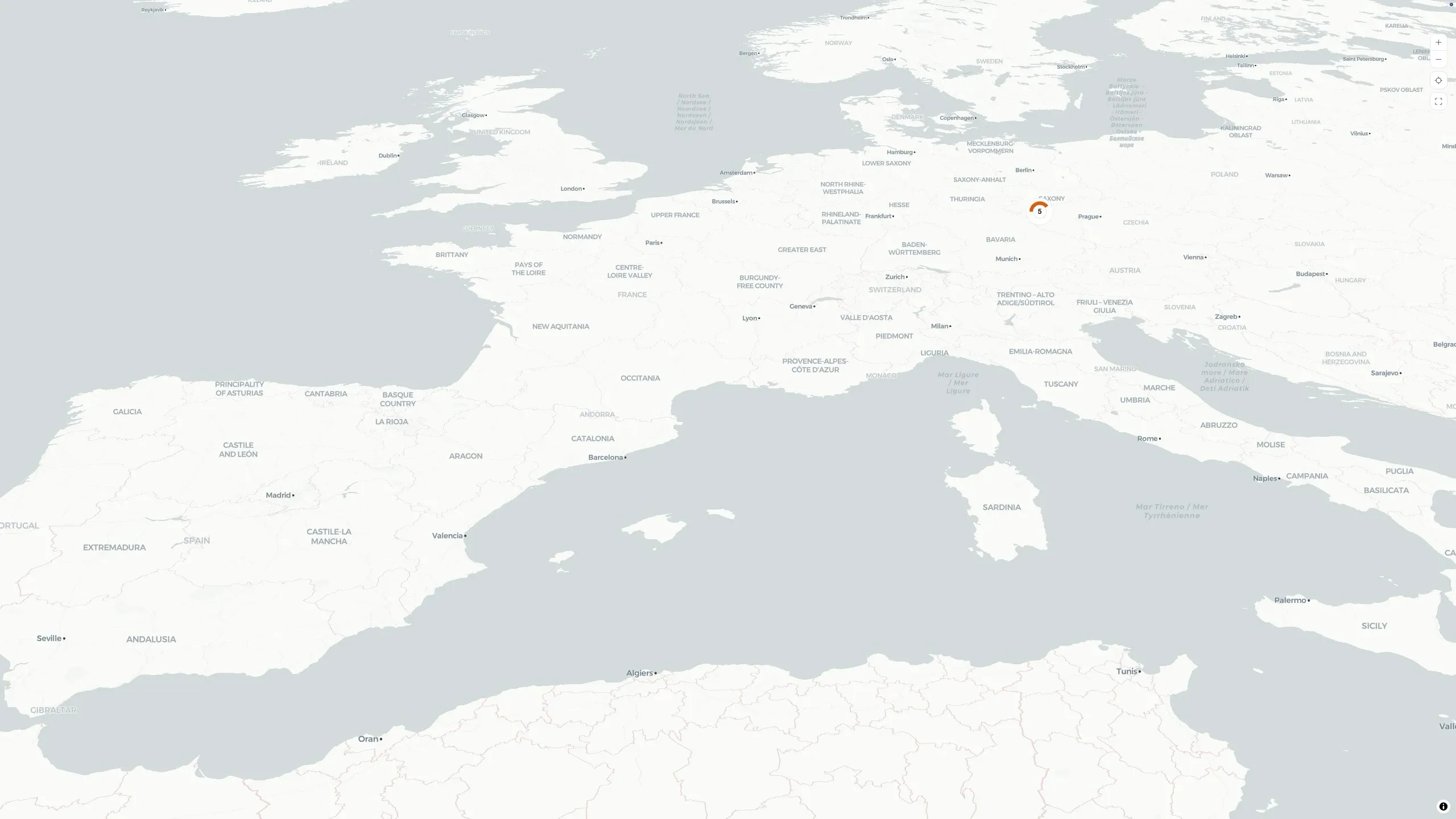
Every selected Wialon unit appears at its latest position, as a direction-aware arrow pointing the way it is heading. Click a unit for its details — speed, odometer, engine hours, satellites, and its sensors. Zoom out and nearby units gather into clusters that show how many units they hold, so a thousand-unit fleet stays readable instead of turning into a pile of overlapping pins.
A few things that keep it practical:
- A vector map that is yours to style — a clean default, plus OpenStreetMap and a tilted 3D view.
- Units without a fix are not hidden — any unit missing live coordinates is listed separately, with its name, plate, and when it last reported, so it does not silently disappear off the map.
- Live — positions and status update as new Wialon messages arrive.
Color the fleet by what matters
This is what makes the map a monitoring tool rather than a picture. In the map settings you choose how to group and color the fleet, and every marker — and every cluster — takes on the result.
By connection status
Pick a cutoff that matters to you — ten minutes, two hours, whatever “normal” looks like for your fleet — and any unit that has not reported within that window is colored as offline, while the ones still reporting stay in the accent color. Leave the cutoff automatic and FleetTAB decides for you. Either way, a unit that has gone quiet stops blending in.
By satellite count
Set a satellite threshold — four is a sensible floor — and units holding fewer satellites than that are colored apart from the rest. A weak or failing GPS fix shows up on the map before it shows up as a gap in your trips.
Spot a whole region at a glance
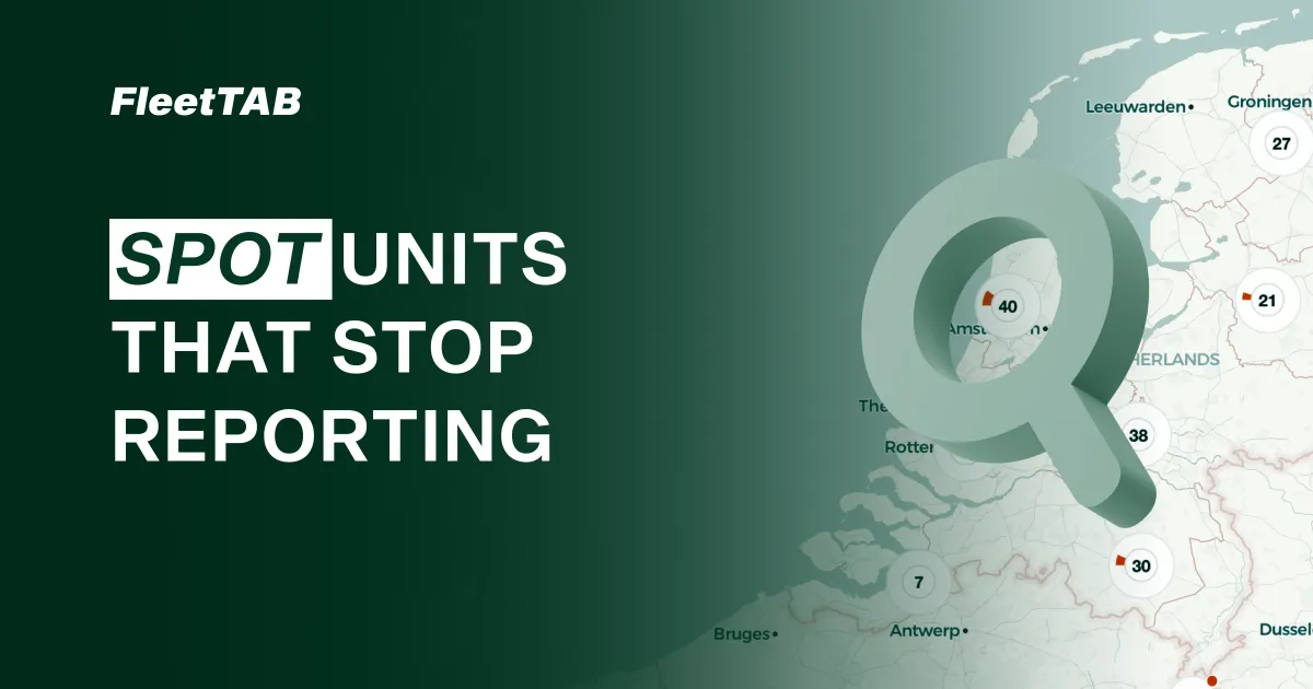
The payoff is at the cluster level. Because each cluster is colored by the same rule, its makeup is visible without zooming in: a cluster that is mostly muted is a region where most units have stopped reporting or lost their satellites. Hover it to see the exact split.
So instead of opening units one by one in Wialon to find out who is offline, you look at the map and the problem area is already shaded for you. When the question turns from where to what is missing, the Events view answers it per detector. For an integrator checking a rollout, or a manager watching coverage across regions, that is the difference between hunting and seeing.
Group the map your way
If there is a way to group, color, or filter the map that would help you watch your fleet, send us a note and we will build it together. The map pairs with the Assets table when you want the same fleet as rows of live values.